LEGO sells products called Sets, and they are made of a number of LEGO Pieces. Sets all have categorical Themes, like Castle and Star Wars. Some, like Star Wars, are licensed from other IPs. Others, like Castle, are not. Sets also include a number of Minifigures, and were released in a certain Year.
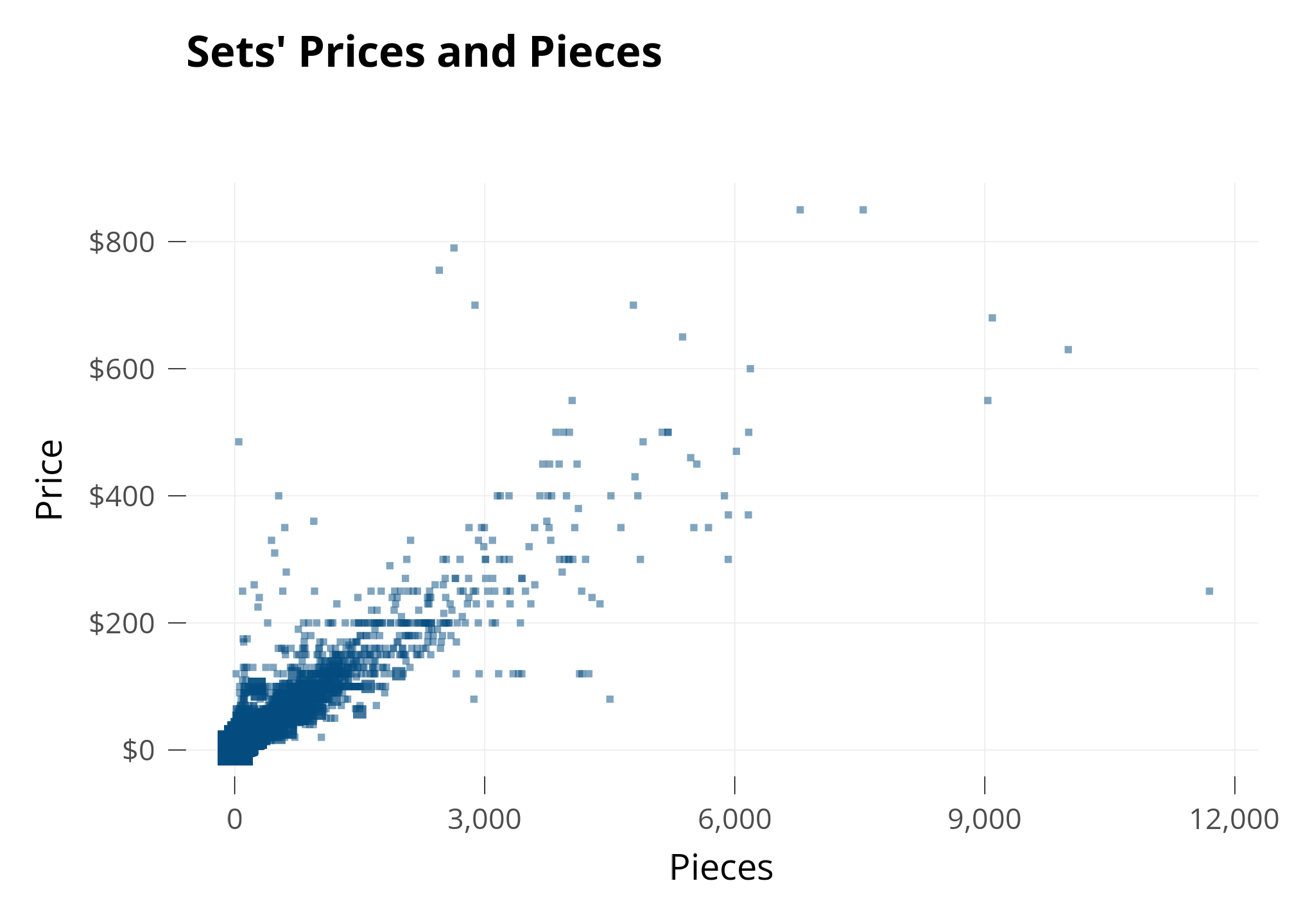
Let’s investigate the Price of LEGO Sets. My first guess is that the Price of each Set is related to how many Pieces it has, so I make a plot with Pieces on the X axis and Price on the Y axis.
Each square is a set. When several sets share the same spot, I make the square bigger.
As expected, Sets’Prices and Pieces seem to be related: The points are grouped together.
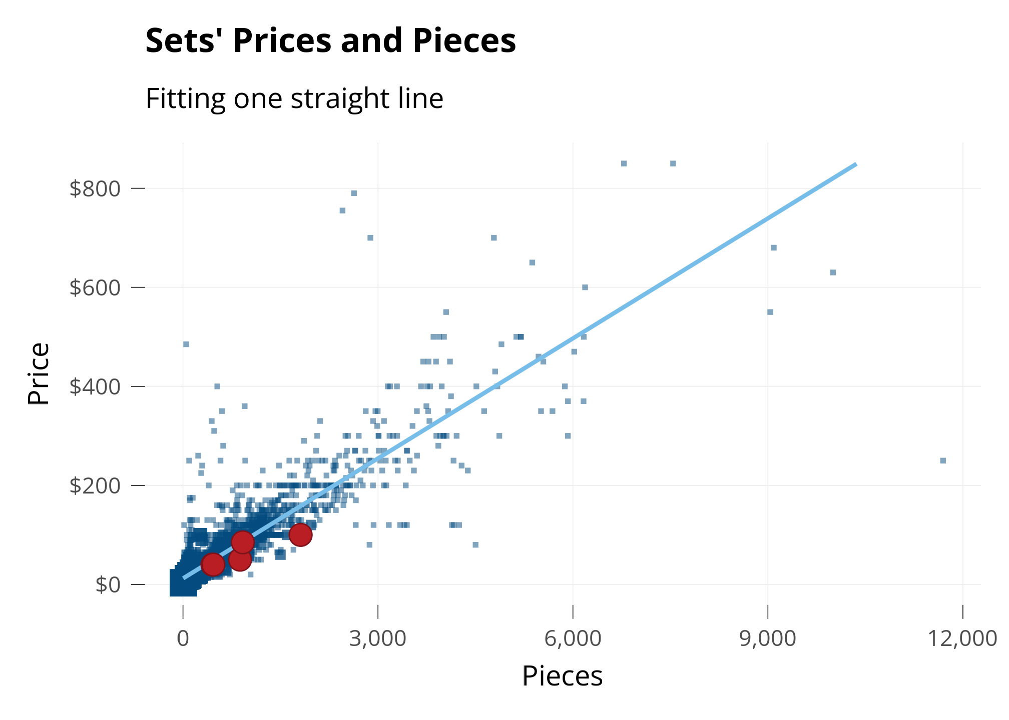
On the Line
To investigate, I’m going to use math to draw a straight line on the graph. The straight line is called a line of best fit. It’s drawn to be the “best line possible” that’s perfectly in the middle between all the points. It’s like taking an average across a range of data.
I’m also going to highlight a few LEGO sets I’ve owned!
The distribution of Sets’ Prices and Pieces seems skewed - Most sets are below $100 and 1,000 pieces, but because there are a few big sets, the graph is very zoomed out.
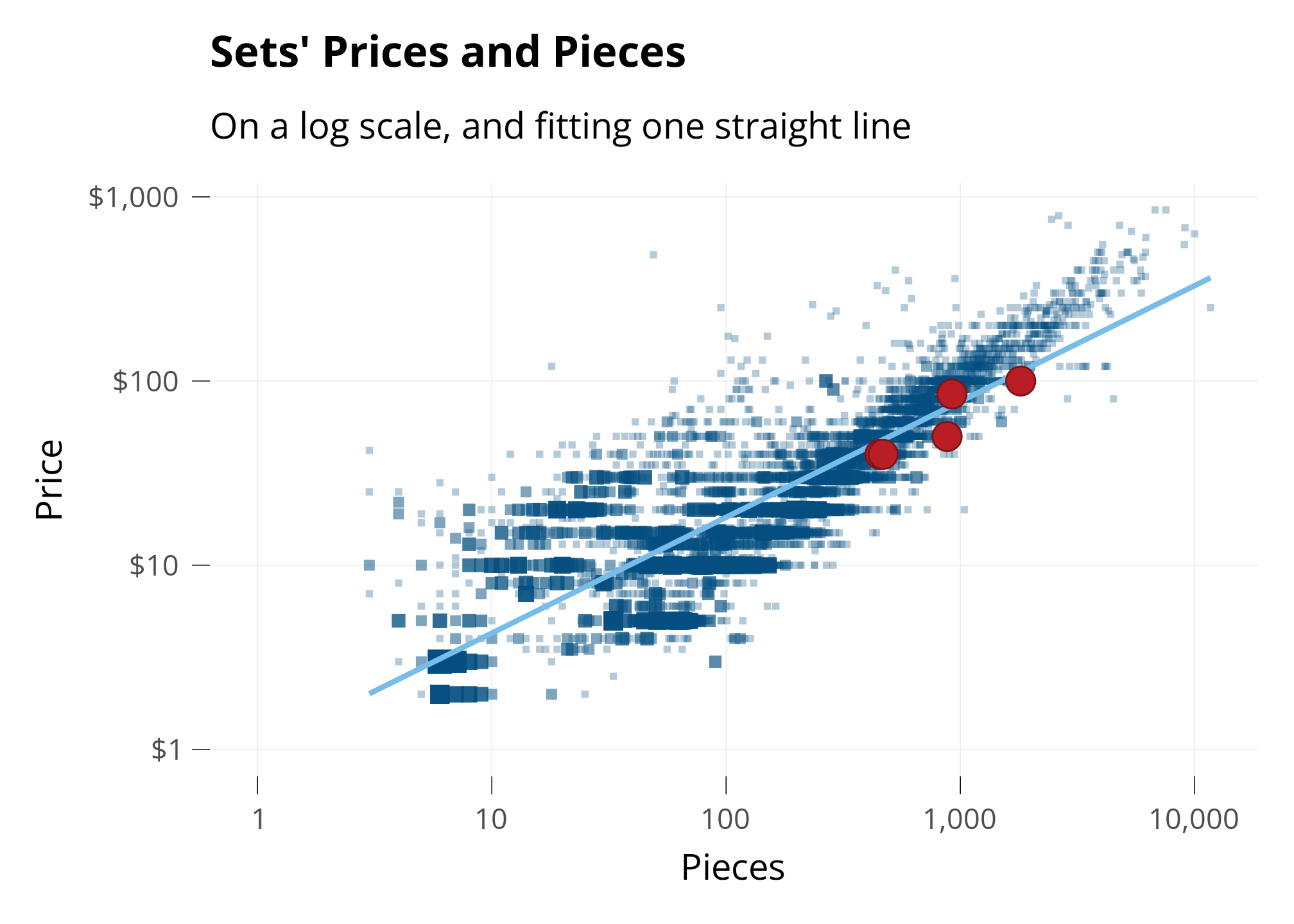
To get a closer look at most of the ldata, I’ll use a mathematical trick to “zoom in” on the ldata we care about.
Changing Perspective: “Log” Scale
Normally, the halfway point between 0 and 100 is 50. We can change this with the Logarithmic Scale (or Log scale).
In Log scale, the halfway point between 0 and 100 is shown as 10. This is really useful when there’s lots of ldata between 0 and 10 and not much ldata between 10 and 100.
Below, I plot the same Sets as above, but on the Log Scale. I’ll put my same four sets on the graph, so we can see how they move.
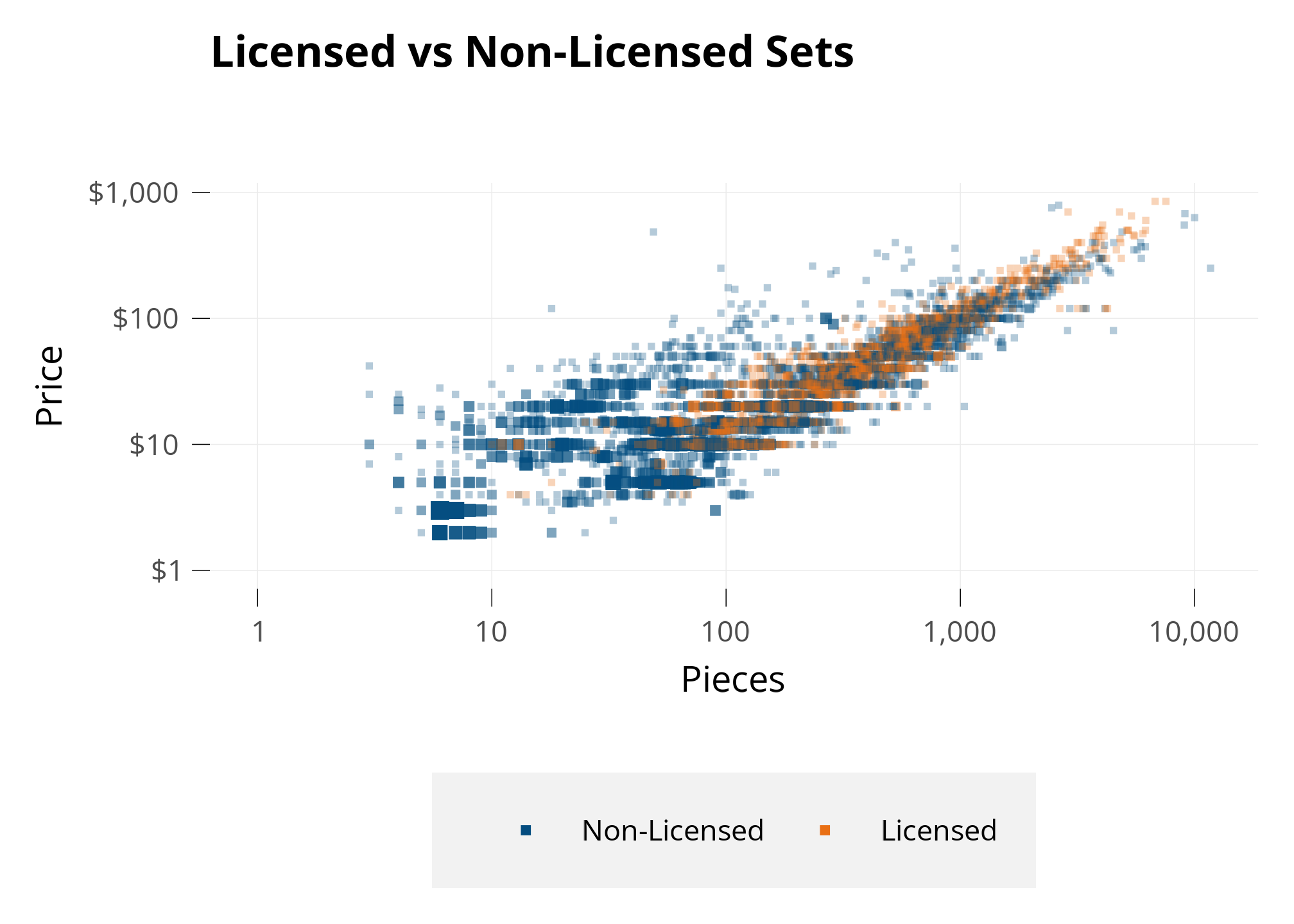
OK, I generally see the licensed color a little higher than the non-licensed color, but we’ll have to use modelling to get more conclusive.
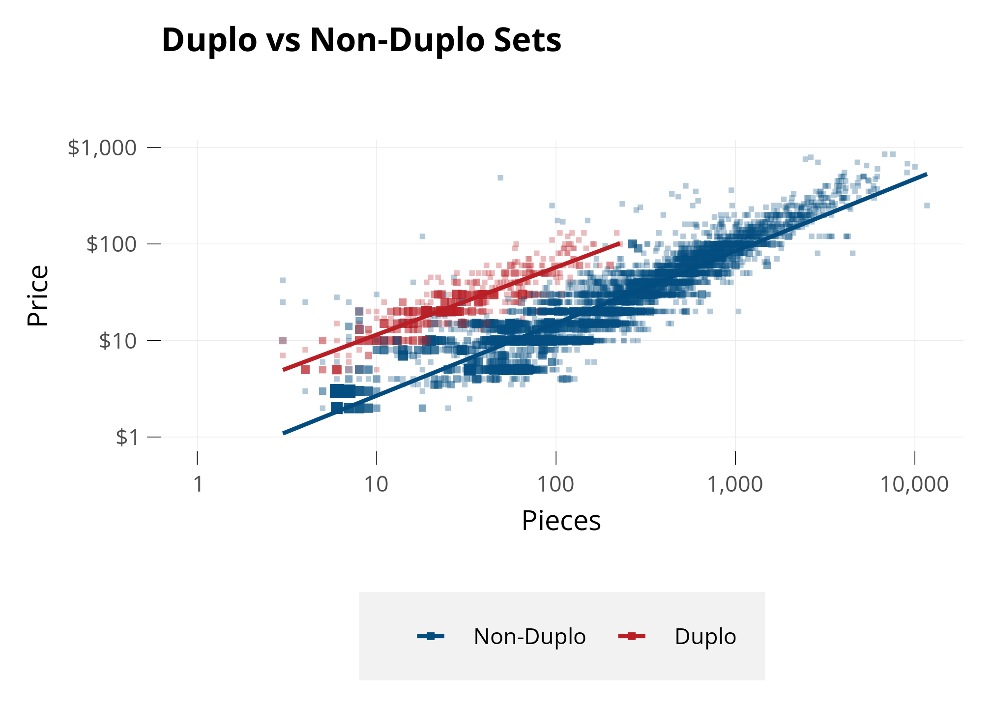
Next, let’s investigate themes. I noticed a group of points above and to the left of the main, larger group. With some analysis, I found that those are sets of the Duplo theme.
Below, I draw another plot and color only the Duplo sets. I also create Lines of Best Fit separately for Duplo and for all other Sets, so we can see if their average prices are different.
Duplo pieces are exactly twice as big as all other LEGO sets, intended for toddlers. Because Pieces is a main driver of Price, it makes sense that twice-as-large Pieces might make a set more expensive due to the cost of material.
These are solid results - all the Duplo sets clearly have a higher Price than the non-Duplo sets even when they have similar Piece counts.
Model
To see the relationship betweeen Price and Pieces, taking into account more than just whether the theme is Duplo or not - we need to reach for one of the most tried-and-true tools in statistics: Linear Regression.1
1 Linear Regression is a statistical model that estimates the relationship between a dependent variable and one or more independent variables.
We’ve actually already used it - those straight lines “of best fit” above are simple linear regressions. But multiple linear regression can handle much more than that. In multiple linear regression, we can ask a model to estimate the relationship between a dependent variable and multiple explanatory variables.
In our case, we’re going to ask a model to fit a straight line for each Theme that explains Price using these factors: Pieces, release Year, number of Minifigs.
Retail price of the LEGO set (dependent variable to be explained).
Pieces
Numerical, log-transformed
Number of pieces in the set; larger sets generally cost more.
Theme
Categorical
Captures theme-specific shifts in price levels.
Pieces × Theme
Interaction (numeric × categorical)
Allows each theme to have its own slope: shows whether the relationship between pieces and price differs across themes.
Year
Numerical
Release year of the set; controls for time trends in pricing (e.g., inflation, product strategy changes).
Minifigs
Numerical
Number of minifigures in the set, captures additional value.
Theme is in this model twice. I add an interaction term that will see how different Themes have different relationships between Piece and Price. Without the interaction term, the model would just consider the difference in Price for each theme as a whole on average.
In R, we run this model with the command:
lm(log(US_retailPrice) ~ log(pieces) * theme + year + minifigs)
With the variables given, it’s able to explain 91.5% of the changes in Price.2
2 This is Adjusted R-Squared of the model. This is the most common measure of how much of the variance in the dependent variable the model is able to explain using the given explanatory variables. Wikipedia
Code
# 1) Grab coefficients; treat any aliased (NA) coeffs as 0 so they don't poison sumsco <-coef(lmt)co[is.na(co)] <-0# 2) Build the model matrix for the fitted modelmm <-model.matrix(lmt)stopifnot("log(pieces)"%in%colnames(mm))col_lp <-which(colnames(mm) =="log(pieces)")col_int <-grep("^log\\(pieces\\):theme", colnames(mm))# 3) Row-specific slope wrt log(pieces): beta_lp + (row's interaction combo)slope_i <-as.numeric(co[col_lp]) +as.numeric(mm[, col_int, drop =FALSE] %*% co[col_int])# 4) Convert "10% more pieces" into % price change, then average (AME)ame_pieces10 <-mean((1.10^slope_i) -1, na.rm =TRUE)ame_minifig1 <-exp(unname(co["minifigs"])) -1ame_year1 <-exp(unname(co["year"])) -1# Optional sanity checks#any(is.na(slope_i)) # should be FALSE#range(slope_i) # slopes across themes/rows#scales::percent(ame_pieces10, accuracy = 0.1)
Let’s interpret what the model says about changes in sets’ characteristics:
A 10% increase in number of pieces is associated with 7.2% higher price on average.
Each additional minifigure is associated with a 3.6% increase in price, holding other variables constant.
A one-year newer release is associated with 0.6% increase in price, holding other variables constant. Accounting for everything else we see, LEGO sets haven’t changed price much over the years.
Code
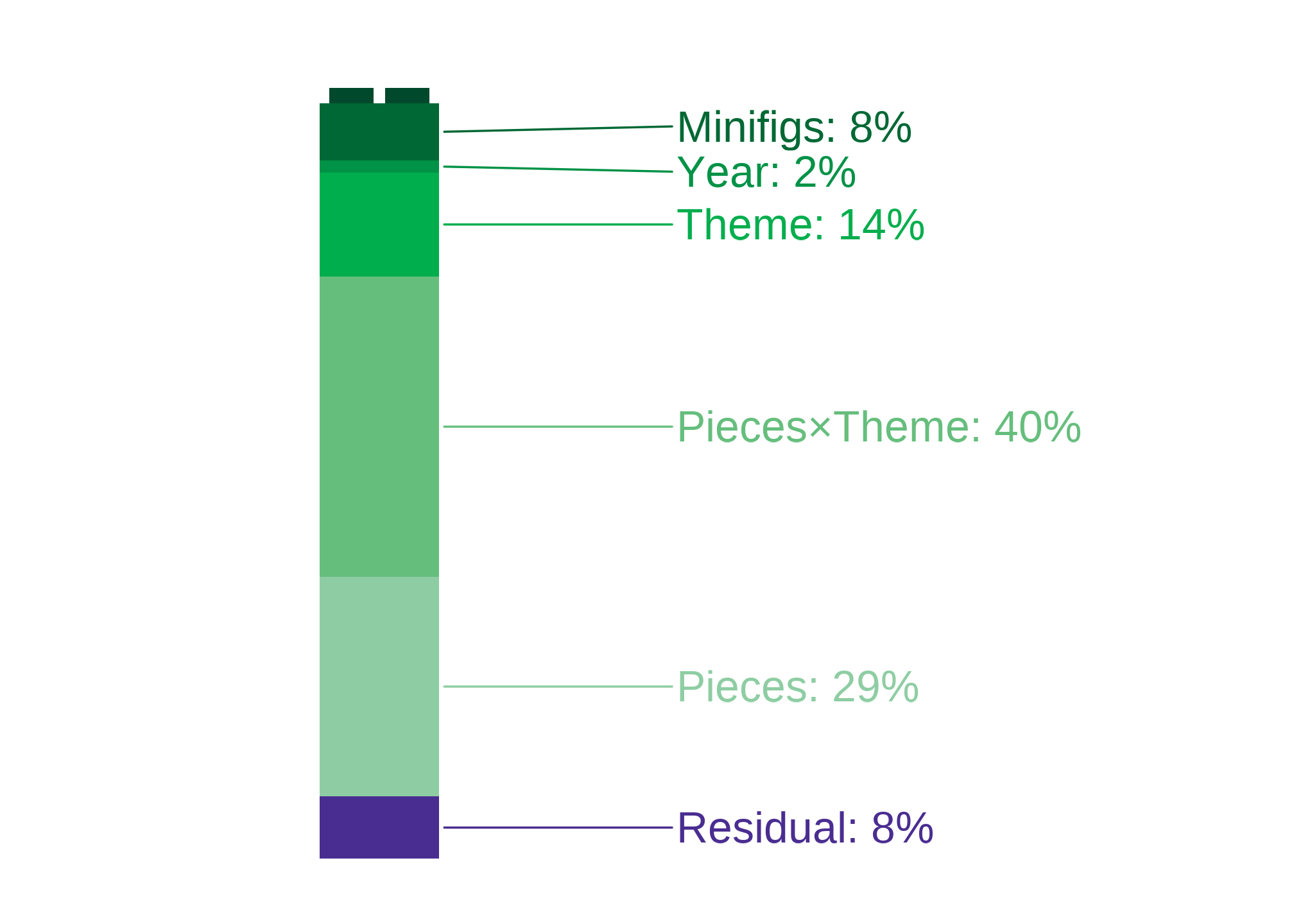
blocks <-c("Pieces", "Theme", "Pieces×Theme", "Year", "Minifigs")block_terms <-list("Pieces"="log(pieces)","Theme"="theme","Pieces×Theme"="log(pieces):theme","Year"="year","Minifigs"="minifigs")# Build a clean modeling data frame from the fitted modelmf <-model.frame(model_lmi)mf <-droplevels(mf)mf$y <-model.response(mf)# Recreate raw vars if only logged versions existif (!"pieces"%in%names(mf) &&"log(pieces)"%in%names(mf)) { mf$pieces <-exp(mf[["log(pieces)"]])}if (!"minifigs"%in%names(mf) &&"log(minifigs)"%in%names(mf)) { mf$minifigs <-exp(mf[["log(minifigs)"]])}if (!"year"%in%names(mf) &&"log(year)"%in%names(mf)) { mf$year <-exp(mf[["log(year)"]])}# Helperssubset_terms <-function(S) { T <-unlist(block_terms[S], use.names =FALSE)if ("Pieces×Theme"%in% S) { T <-unique(c(T, block_terms$Pieces, block_terms$Theme)) } T}rhs_formula <-function(S) { ts <-subset_terms(S)if (length(ts) ==0) {"1" } else {paste(ts, collapse =" + ") }}key <-function(S) {if (length(S) ==0) {"<BASE>" } else {paste(sort(S), collapse ="|") }}r2_cache <-new.env(parent =emptyenv())get_r2 <-function(S) { k <-key(S)if (exists(k, envir = r2_cache, inherits =FALSE)) {return(get(k, envir = r2_cache)) } fml <-as.formula(paste("y ~", rhs_formula(S))) fit <-lm(fml, data = mf, na.action = na.omit) r2 <-summary(fit)$r.squaredassign(k, r2, envir = r2_cache) r2}fact <-function(m) {if (m <=1) 1elseprod(2:m)}wgt <-function(s, n) {fact(s) *fact(n - s -1) /fact(n)}# Exact Shapley (LMG) over the 5 blocksn <-length(blocks)phi <-setNames(numeric(n), blocks)for (bi in blocks) { others <-setdiff(blocks, bi)for (s in0:length(others)) { Ssets <-if (s ==0) {list(character(0)) } else {combn(others, s, simplify =FALSE) }for (S in Ssets) { r2_S <-get_r2(S) r2_Si <-get_r2(c(S, bi)) phi[bi] <- phi[bi] +wgt(length(S), n) * (r2_Si - r2_S) } }}total_r2 <-get_r2(blocks)variance_shares <-tibble(feature =c(names(phi), "Residual"),sumsq =c(unname(phi), 1- total_r2)) |>mutate(share =100* sumsq /sum(sumsq))
Next, let’s see what the model says about the factors that contribute to the price of a LEGO set.
The variables in the model each affect the predicted price.
We’re able to interpret how much each of the variables affects the price, to see how influential each variable is.
Sets’ pieces in general, and differences by theme.
Pieces alone account for 29.1% of variation in price.
The Theme×Pieces interaction (themes having different piece–price relationships) accounts for 39.7% of the variation in price.
Theme-level differences.
The virtue of a set being a certain theme contributes 13.8% of its price.
Other controls.
Minifigs explains 7.6% of the variation in price. That’s quite substantial.
Year explains 1.5% of the variation in price. LEGO sets haven’t changed much in price, considering these other variables.
Residual share. About of the variance in Price isn’t explained by this model. That’s called a residual.
I plot this below, to show what makes up a price!
Shares come from a Shapley/LMG decomposition over the five blocks {Pieces, Theme, Pieces×Theme, Year, Minifigs}. “Unexplained” equals 1−R21-R^21−R2; small differences from adjusted R2R^2R2 reflect the adjustment and rounding.
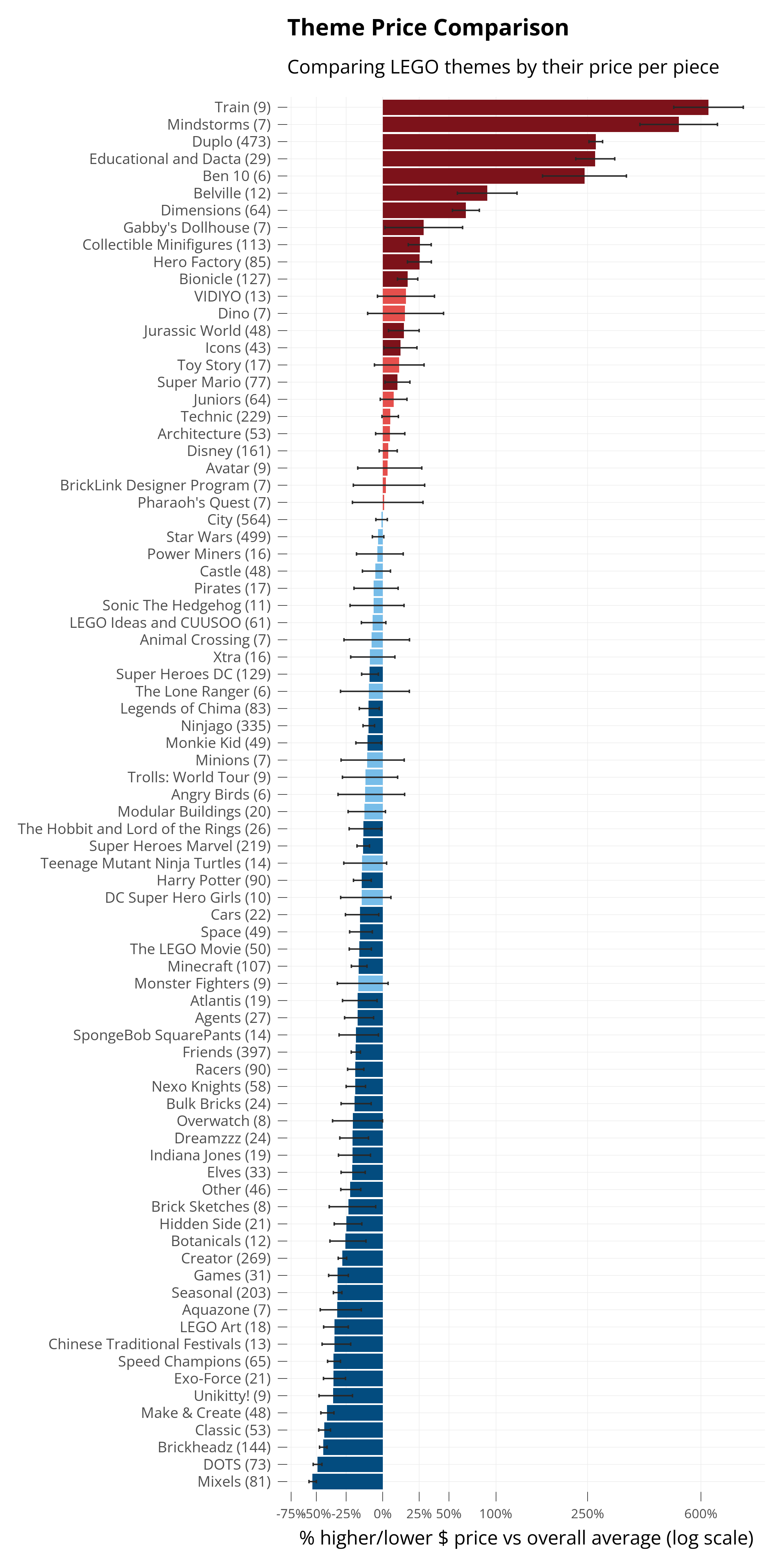
Different themes have different prices. Below, I plot how each theme’s prices are different than the average of all themes.
Because we used our model, this accounts for the fact that some sets may have more pieces than others. The virtue of a set being a certain theme is isolated, from the other variables we told the model to take into account.
The small lines show the confidence interval for the estimated effect on price. The model is estimating, and it reports the range in which it’s 95% sure about its prediction. When that 95% confidence interval doesn’t cross zero, it’s called statistically significant, and I darken the color bar for that theme.
Code
theme_counts <- dplyr::count(ldata, theme, name ="n")pal <-setNames(lego_colors$hex, lego_colors$color)# 1) Grab the k-1 named theme coefficients (sum coding omits the last level)tid <-tidy(lmt, conf.int =TRUE)theme_terms <- tid %>%filter(str_starts(term, "^theme")) %>%transmute(theme =str_remove(term, "^theme"), estimate, conf.low, conf.high)# 2) Recover the omitted last level with proper SE and CI from vcovV <-vcov(lmt)present <-paste0("theme", theme_terms$theme)a <-rep(-1, length(present)) # coefficients for -sum(present)est_last <--sum(theme_terms$estimate)var_last <-as.numeric(t(a) %*% V[present, present, drop =FALSE] %*% a)se_last <-sqrt(var_last)alpha <-0.05crit <-qt(1- alpha /2, df =df.residual(lmt))ci_last <- est_last +c(-1, 1) * crit * se_lastlast_theme <-setdiff(lev, theme_terms$theme)theme_full <-bind_rows( theme_terms,tibble(theme = last_theme,estimate = est_last,conf.low = ci_last[1],conf.high = ci_last[2] ))# 3) Back-transform to % diffs vs overall mean (exact, not linearized)label_percent_from_log <-function(x)percent(exp(x) -1, accuracy =1)theme_tbl <- theme_full %>%mutate(p =exp(estimate) -1,plo =exp(conf.low) -1,phi =exp(conf.high) -1 ) %>%mutate(y =sign(p) *log1p(abs(p)),ymin =sign(plo) *log1p(abs(plo)),ymax =sign(phi) *log1p(abs(phi)),fill_name =case_when( phi <0~"Lblue", plo >0~"Ldred", p <0~"Llblue", p >0~"Llred",TRUE~"Lyellow" ) ) %>%arrange(desc(y)) %>%left_join(theme_counts, by ="theme") %>%filter(n >5) %>%mutate(theme_lab =paste0(theme, " (", n, ")"))# symmetric percent tickspct_ticks <-c(-0.75, -0.50, -0.25, 0, 0.25, 0.50, 1.00, 2.5, 6.00)breaks <-sign(pct_ticks) *log1p(abs(pct_ticks))ggplot(theme_tbl, aes(reorder(theme_lab, y), y, fill = fill_name)) +geom_col() +geom_errorbar(aes(ymin = ymin, ymax = ymax),width =0.2,color ="#272727") +coord_flip() +scale_fill_manual(values = pal) +guides(fill ="none") +scale_y_continuous(breaks = breaks,labels = scales::percent(pct_ticks, accuracy =1)) +labs(x =NULL,y ="% higher/lower $ price vs overall average (log scale)",title ="Theme Price Comparison",subtitle ="Comparing LEGO themes by their price per piece", ) +theme(#aspect.ratio = 1,axis.text.y =element_text(size =rel(0.95)),axis.text.x =element_text(size =rel(0.85)) )
The x-axis is also set to log scale, since some themes have such high variation in prices.
We can see Duplo high up, like we saw in the beginning! The model estimates Duplo sets are 200% more expensive - or three times as expensive as the average.
Theme Price Trends
Each theme also has a different trend between Price and Pieces.
LEGO Art is not only cheaper than expected overall - it’s price also doesn’t increase as much as others do, as the sets have more pieces. It has a flatter piece-price trend.
Some themes have sets of all the same price no matter how many pieces they have. For Mixels, all sets from 45 to 75 pieces are all $4.99. Its piece-price trend is a straight line.
Train actually has a negative relationship with price, despite being the most expensive theme overall!
To investigate, I plot all sets and let us overlay each theme’s own trend as well as its own sets.
You’re ready to try the imaginator! Use this model to predict the price of a set you imagine.
Final Thoughts
In the world of AI and neural networks, simple models like linear regressions can look unglamorous. But, sometimes the simplest tools work surprisingly well.
Like Emmet shows us in The LEGO Movie - sometimes, a simple model, thoughtfully made and used, can be the right tool for the job - even if it doesn’t look flashy.
Appendix
Data Availability
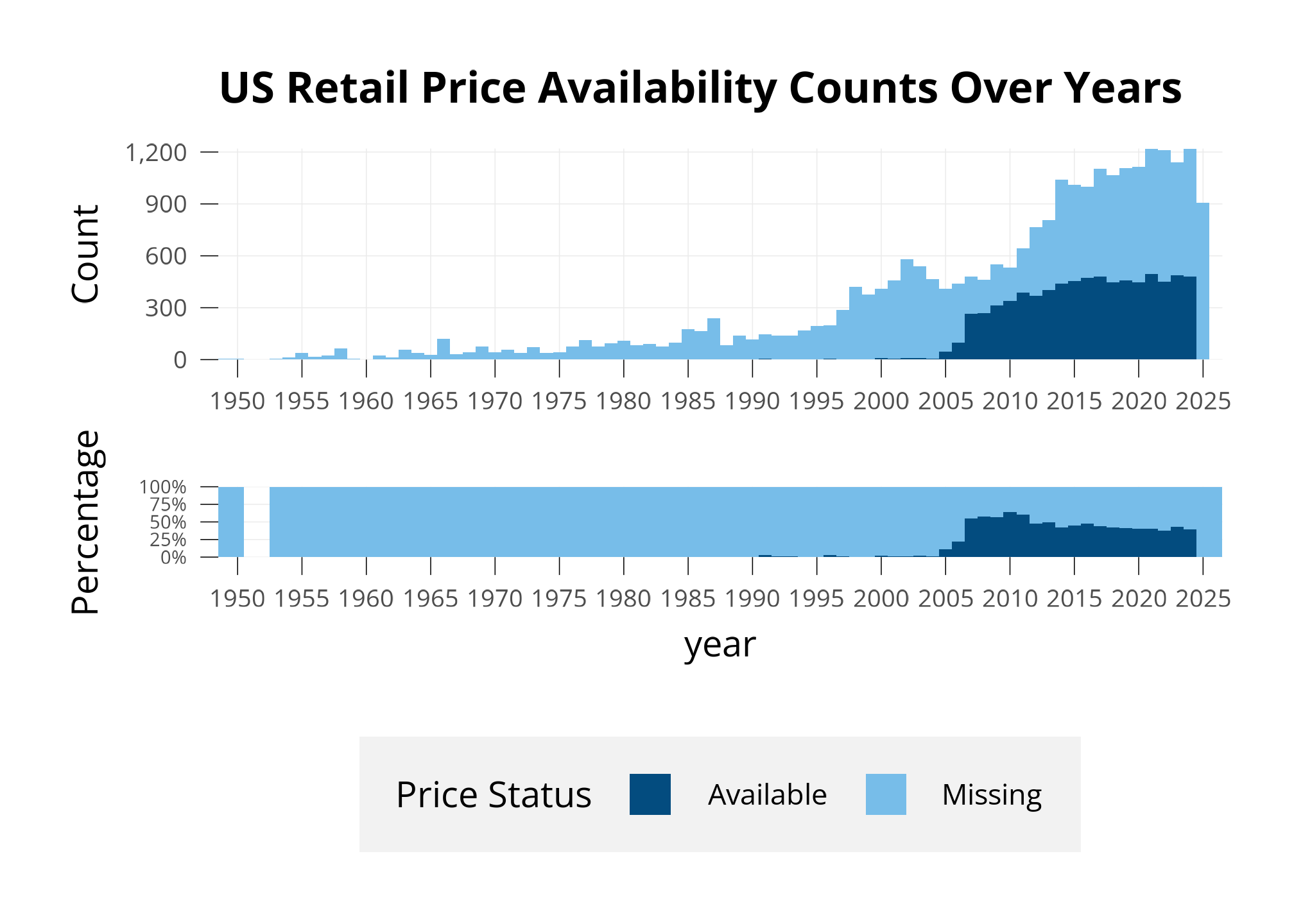
Before beginning any data analysis, it’s important to inspect what data you have. 25389 sets are available in the dataset, and 6057 of them have a US retail price.
Below, I show a few different ways of assessing this missingness.
First, I plot how many sets we have prices for, compared to all sets. I plot this below in two types of bar charts.
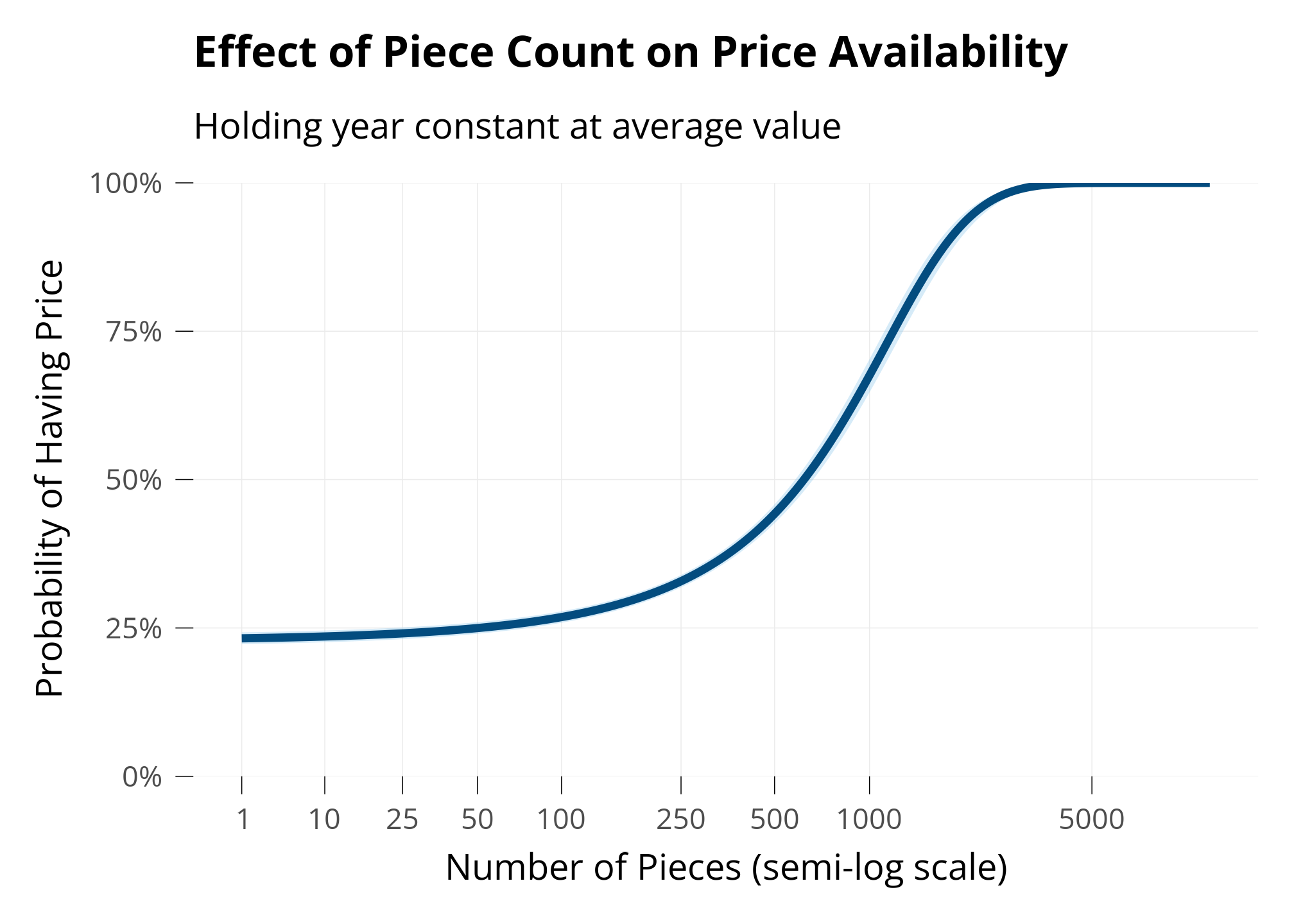
Finally, to see what we should expect about price availability with respect to piece count, I fit a logistic regression model predicting whether a set has a price available or not, using piece count and year as predictors.
This model shows that we’re more likely to be missing prices for small sets, and less likely to be missing prices for large sets.
Code
sets_mp <- sets_m %>%mutate(pieces =as.numeric(pieces),have_price =as.numeric(price_availability !="Missing")) %>%filter(pieces >0, set_num !="BIGBOX-1") #An outlier of a very large set with a missing priceprice <-glm(have_price ~ pieces + year,data = sets_mp,family =binomial(link ="logit"))#summary(price)#plot(price)# Generate predictions at mean yearpred_pieces <-ggpredict(price, terms ="pieces [all]", condition =c(year =mean(sets_mp$year)))# Custom breaks for piece countsbreaks <-c(1, 10, 25, 50, 100, 250, 500, 1000, 5000)# Plot with LEGO colorsggplot(pred_pieces, aes(x, predicted)) +geom_ribbon(aes(ymin = conf.low, ymax = conf.high),fill = lego_palette["Llblue"],alpha =0.3) +geom_line(color = lego_palette["Lblue"], linewidth =1.5) +labs(x ="Number of Pieces (semi-log scale)",y ="Probability of Having Price",title ="Effect of Piece Count on Price Availability",subtitle ="Holding year constant at average value" ) +scale_y_continuous(labels = scales::percent,limits =c(0, 1),# Forces y-axis from 0% to 100%expand =c(0, 0) # Removes padding at axis ends ) +scale_x_continuous(trans =trans_new(name ="softlog",transform =function(x)log(x +10),inverse =function(x)exp(x) -10 ),breaks = breaks,labels = breaks )
Model Diagnostics
The ANOVA table below shows that all terms are highly statistically significant.
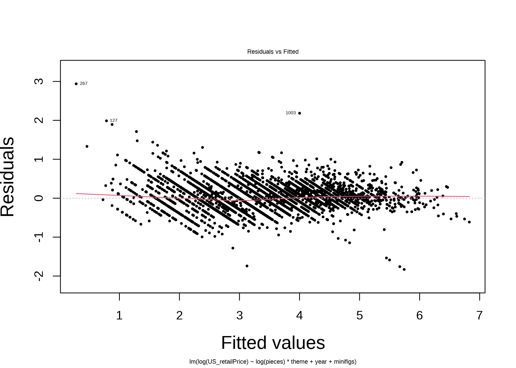
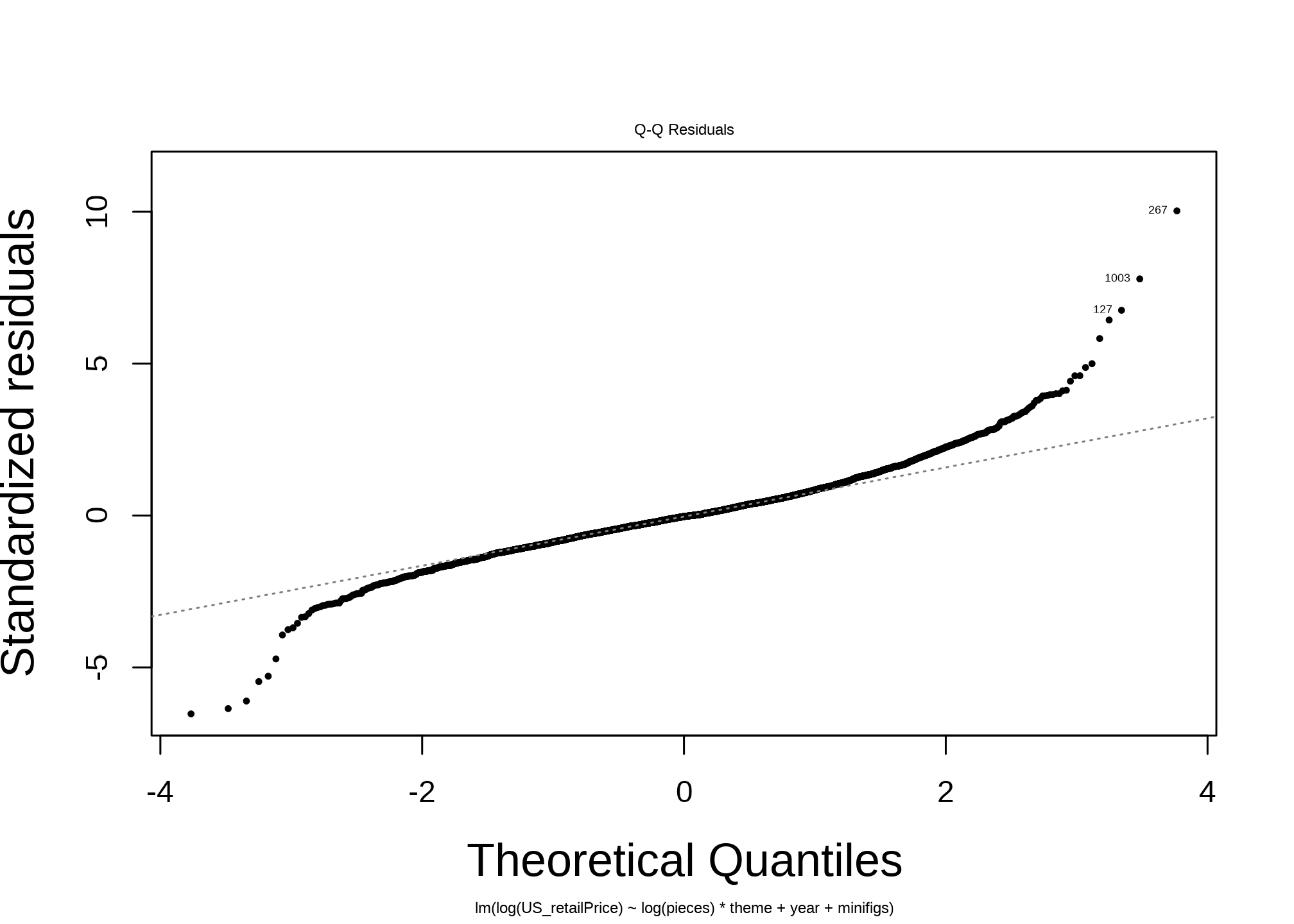
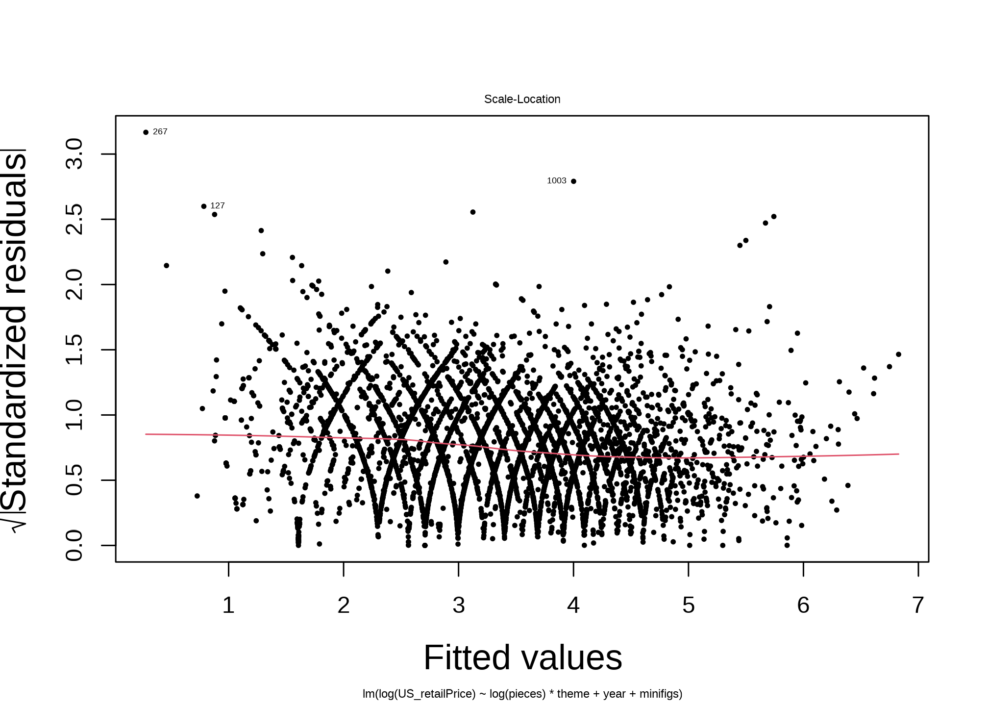
Next, the diagnostic plots tell an optimistic story. For such a simple model, it performs well.
The Residuals vs Fitted plot shows residuals without any dominant shape, while there are some patterns in outliers: There is a clear upward curvature of the residuals for the smallest fitted values. For small sets, the model is under-predicting the price.
The QQ plot shows meaningful deviations at the tails.
The Scale-Location plot has intricate curving patterns. I interpret this to be the becasue of the Discrete Price Levels I discuss below.
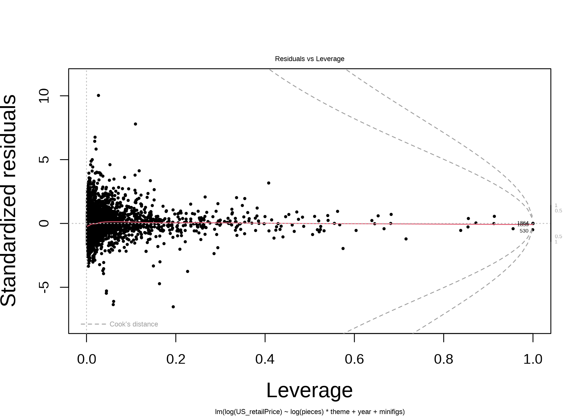
The Residuals vs Leverage plot shows many strong outliers. This makes sense, as I’m sure there’s much that isn’t captured by the model, like promotional sets, one-off special sets, and other kinds of material outliers.
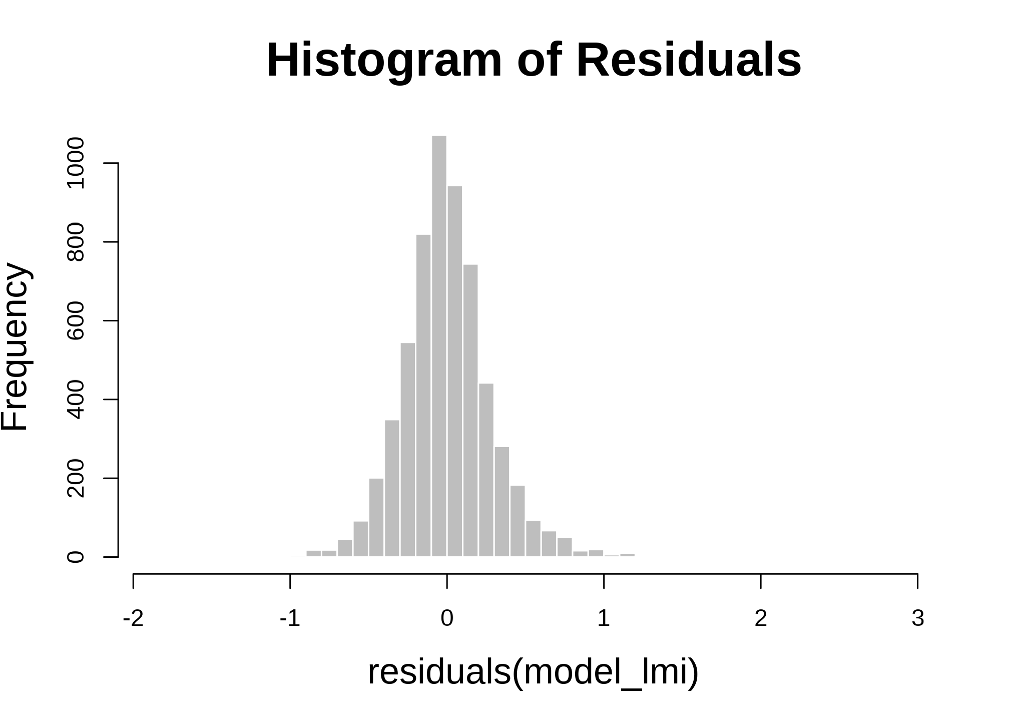
I’m always interested in heteroskedasticity of the residuals. While more robust tests and procedures exist to treat heteroskedasticity, I’m satisfied with this for now.
hist(residuals(model_lmi), breaks =50, main ="Histogram of Residuals", col ="gray", border ="white")
Model Considerations
Shaping the Data to the Model - or Vice Versa
As always in data work - the dataset called Sets includes categories of things that I wouldn’t really call sets:
A line of collectible Minifigures of popular licensed characters, which have 0 pieces and 1 minifigure and are more expensive than expected
Small bundles of 1-5 special pieces old not as a designed set but as bespoke pieces by themselves
Products that aren’t sets at all: Keychains, books, and backpacks
Electrical motors that are counted as the one piece of a one-piece set, and are expensive
Two main options are available to deal with this:
Removing categories of things that don’t get at what you really care about
Changing the model to incorporate the things you don’t care about
There are advantages and disadvantages to both. Here, I removed sets that had less than 3 pieces.
Discrete Price Levels
Like most retail products, LEGO sets are not priced at continuous decimals like $12.43 - they are usually at levels like $12.99, and at higher prices, further bunch to categories like $79.99 instead of $77.99. I didn’t consider this in this model, but would like to have done so.
Nonlinear Parameters
In the case of low-piece sets, I theorize a nonlinear shape of the price-piece relationship: Sets have a fixed cost to sell. A 1-piece special minifigure may cost $4, and a small 20-piece set may cost $4, implying a negative piece-price relationship. A nonlinear parameter can capture this relationship, where fixed costs show a negative relationship at low Ns and then more linear positive relationships after that “dip.” I didn’t consider that in this model, instead opting for linear estimators.